Agile
Reported to the Head of Mobile & Design
Daily stand-ups with the dev team (~20 engineers)
Bi-weekly sprint planning & retrospective


Project: Media Center for Schwab Mobile App
THE WHY
In 2017, we partnered with a customer experience agency to understand how investors consumed financial content. Our research focused on identifying content consumption habits for investing strategies, education, and relevance. Through surveys and user journeys, we gathered insights that shaped the content delivery within Schwab’s mobile app.

RESEARCH OBJECTIVES & METHODOLOGY
We set out to understand key factors influencing content consumption around investing strategy and education. Our research approach included surveys (200+ participants) and journey mapping (100+ participants) with both prospects and clients. We asked questions like:

• “What are your primary sources for financial information?”
• “What types of finance content do you prefer?”
• “Do you actively seek information, or is it passive?”
• “Is there a regular routine for consuming finance-related content?”
KEY INSIGHTS
Schwab’s website was a go-to source, with about 50% of the users following a routine for financial content consumption.
Users gravitated toward online articles but needed help interpreting complex information.
🚩 PAIN POINT
Users struggled with interpreting complex content and sought clearer insights on “what this means for me.

THE OPPORTUNITY
Our research surfaced a clear gap: users needed more than just general financial information—they wanted content that answered, “what does this mean for me?”
"It's not hard to find information on this topic, but it's a lot harder to try to ferret out what it all might mean to the financial/investor community. I've about given up on it, but one thing I consider is going to cash until the dust settles."
- A Schwab Customer

This graph from the quarterly app traffic report highlights the peaks and valleys in the time Schwab mobile app users spend on content and research activities. It clearly shows that users engage with these resources primarily during the workweek, with a noticeable drop in activity over the weekends.
PRIMARY AREAS OF OPPORTUNITY
1. Users’ number one request was for more research content within Schwab’s app.
2. Mobile devices are the preferred tool for financial research throughout the workweek. However, users often struggled with interpreting complex topics, taking action only when insights were straightforward.
💡 SO, I THOUGHT,
what if Insights content could provide that ‘so what’ factor, bridging general knowledge with actionable context?
THE GOAL
My goal was to design a streamlined, mobile-first Media Center that minimized information overload and delivered curated, relevant insights on the go. This approach ensured users could quickly access content tailored to their financial needs, making it easier for them to connect insights with actionable decisions.
GUIDING PRINCIPLES

• Curate relevant insights: Users wanted information that truly mattered to them.
• Provide fresh content: Keep the information dynamic and up-to-date.
• Make it easy to consume: Ensure users could quickly digest key insights.
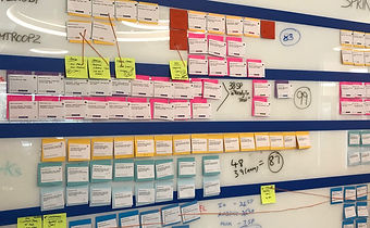
THE DESIGN
Now that we’re clear on the goal, here’s the design process I led to bring it to life. Starting with a detailed project brief and design workshop, I guided the team through usability research, prototyping, and continuous iteration.
INHERITED CHALLENGES
 |  |
|---|---|
 |
• The retail app offered minimal content;
• The “Insights & Ideas” section on Schwab.com had too much;
• A standalone app (OnInvesting) was being retired.
THE NEW MEDIA CENTER
Video from CNBC and Schwab’s YouTube channel
Audio from Schwab Market Updates and the Choiceology Podcast
Text from OnInvesting articles, Schwab.com, and financial news sources
PROCESS
Frame the problem:
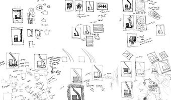
We started with a project brief, a design workshop, and a conceptual prototype.
Approve model:
The design evolved through usability testing, user flows, wireframes, and visual design iterations.
Deliver solution:
We finalized the specs, supported development, and ran UX QA testing to ensure consistency and quality.


COMPETITIVE ANALYSIS
 |
|---|
To ensure our design would stand out, we conducted a thorough competitive analysis of other financial apps, highlighting their strengths and areas for improvement. These insights fed directly into our design iterations.
📐 DESIGN ITERATION & TESTING
Throughout multiple rounds of testing, we iterated on the design based on direct user feedback, adjusting layouts, navigation, and overall flow. Each cycle refined the visual elements to create an experience that felt intuitive, immersive, and aligned with user expectations.


AN INSIGHT-DRIVEN DESIGN DECISION:
TO MUTE OR NOT TO MUTE
An interesting moment in the design process was deciding whether video and audio should be muted by default. Our data revealed that most users interacted with the app during their weekday commute—on buses or trains. We noticed a pattern: users frequently muted videos manually, either to avoid disrupting those around them or for privacy. With this data in hand, we made the decision to mute media by default, optimizing the experience for their environment. This was a clear example of how data drove our design decisions.
_edited.jpg)
THE OUTCOME
The Media Center launched in Q4 2018, quickly becoming a key feature for Schwab’s users. Its impact was evident almost immediately, with metrics reflecting a substantial increase in both engagement and satisfaction. Highlights include:
-
30% increase in content engagement, measured through various internal data analytics tools.
-
Higher user satisfaction, as seen in improved survey feedback and App Store ratings.
-
A unified, scalable solution that streamlined content delivery across platforms, driving more traffic than Schwab’s podcasts and website combined for educational content.

MY TAKEAWAYS
LEARNING THE VALUE OF REAL USER NEEDS
Seeing how quickly engagement spiked with the Media Center’s launch showed me how powerful it is to understand what users actually want. For example, prioritizing privacy for commuters and adding richer content made a real difference in how users connected with the app—and they rewarded it with higher traffic and ratings. Knowing their needs wasn’t just a checkmark but the core of a much better experience.
PUTTING CUSTOMER FEEDBACK AT THE CENTER
Designing around real feedback turned vague insights into direct benefits. Instead of just creating for general audiences, I focused on details users specifically asked for, like more comprehensive research content. This focus not only helped us create a product that felt tailored but also earned user trust, giving the app a solid edge and real staying power.
